
Design Research
From Data to Decisions: Turning Survey Noise into Direction
An average is the easiest number to report and the easiest to misread. The real signal wasn't in the score. It was in who the score belonged to.
Data shown is illustrative to protect client confidentiality
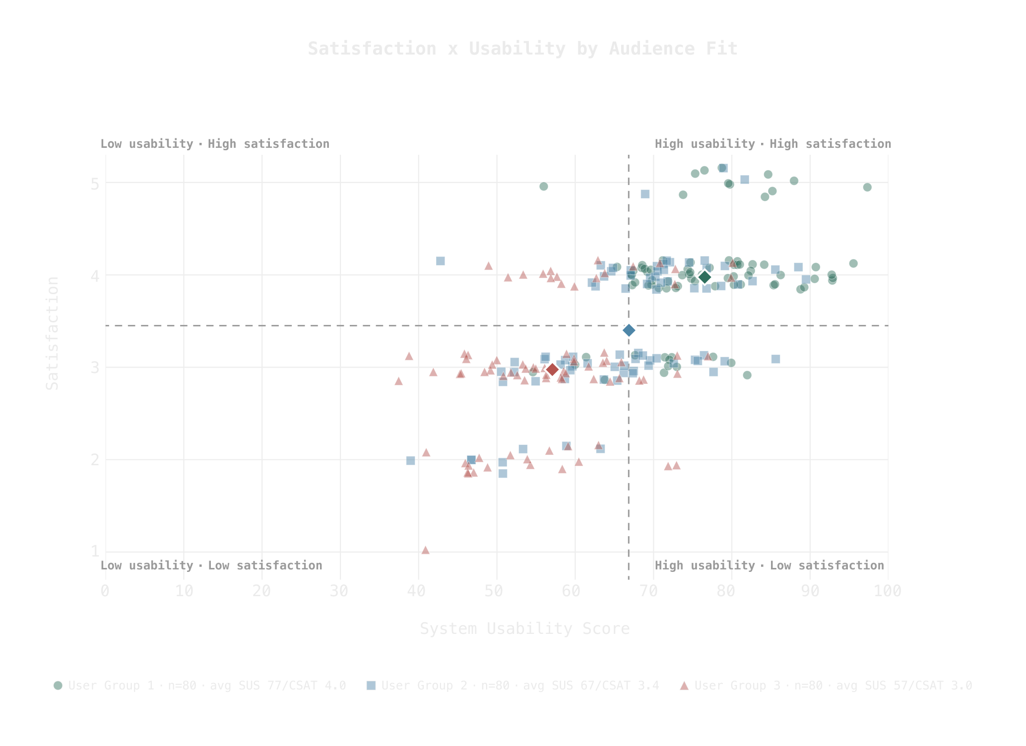
Impact at a glance
Tracked usability (UMUX-Lite) and satisfaction (CSAT) across multiple surveys
Read the scores by product–audience fit instead of one blended average
Used open-text synthesis to explain why each segment moved, turning the data into prioritized decisions
Highlights
- Segmented every score by product–audience fit, so one blended average never hid three different stories
- Built a question-level matrix to catch where needs, ease, and satisfaction diverged from one another
- Paired the scores with their open text, so every what-happened came with a why
Context
My role was to turn that noise into direction.
I synthesized multiple UMUX-Lite surveys using mixed research methods to reconcile the conflicting signals, then translated the findings into priorities the team could actually build against for future roadmaps.
Problem & Opportunity
The product had numbers. It didn't have answers.
Satisfaction and usability had been surveyed across multiple surveys, and the results looked contradictory. Scores rose in one organization and sank in another. The same feature drew praise in one comment and a complaint in the next. Averaged together, everything flattened into a number that looked stable and said nothing.
The pressure was to "just report the score" and create a backlog of features requested. But a blended average treats every organization as the same user, and these weren't the same users: some were the audience the product was built for, some were close to it, and some were using it for things it was never designed to do. Folding them into one number buried exactly the differences that mattered.
The opportunity was bigger than one report. Read properly, the surveys could become a baseline: a way to track usability and satisfaction by audience as the product matured and grew, so each new survey answered not just "how are we doing" but "for whom, and why."
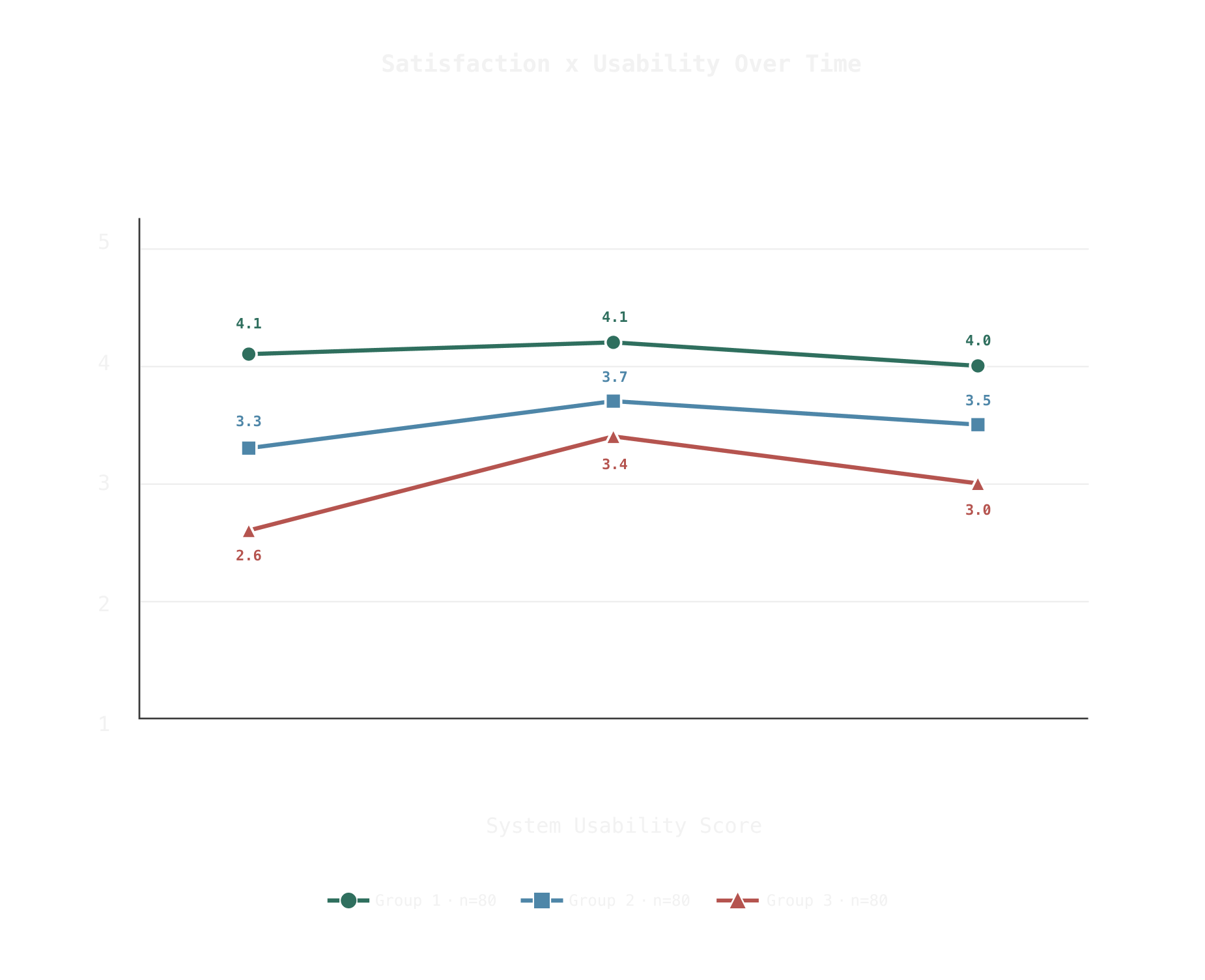
Data shown is illustrative to protect client confidentiality
Solution / Process
"Just report the score" is where the real problem started. The work happened in two passes.
The first pass was a single survey. Rather than collapse the three rating items into one number, I built a matrix that broke them apart, holding needs, ease, and satisfaction side by side, so I could see where they diverged: where ease ran high but satisfaction lagged, or where a strong score sat on top of a recurring complaint. Then I synthesized the open-text responses against that grid, using the qualitative signal to explain each gap the ratings exposed.
The second pass was longitudinal — all surveys at once. I compared the surveys across organizations by product–audience fit, arranging them along a spectrum:
- Target. Organizations the product was originally built for.
- Adjacent. Organizations close to that intent, using it in nearby ways.
- Unintended. Organizations using it for something it was never designed to do.
For each group I tracked the emerging baseline of the usability score (UMUX-Lite, as a SUS proxy) and CSAT over time, then synthesized each group's open text to explain the movement: what the target audience cared about, and where the unintended users were running into walls nobody had reported. The scores said what was happening to each audience; the open text said why.
Results
- Product strategy. The findings, presented to major stakeholders, set direction for product strategy and secured additional funding to act on the recommendations I had provided.
- Baseline. The segmented read became the start of a baseline for tracking future growth and user sentiment as the product matures.
Reflection / What I Learned
A stable average and the most-requested features would have made a tidy roadmap. The value lived in splitting the number by who it came from and letting the open text explain the spread. The open-text field was never an accessory to the quantitative data; it was the only thing that explained it.
I was synthesizing data I didn't collect. The surveys were written and sent by the stakeholders, and each survey asked things a little differently. Mixed methods let me reconcile what I was given, but reconciliation has a ceiling, so my recommendations went upstream too: keep the instrument consistent from survey to survey, so the data compounds and confidence in the scores grows with it.